
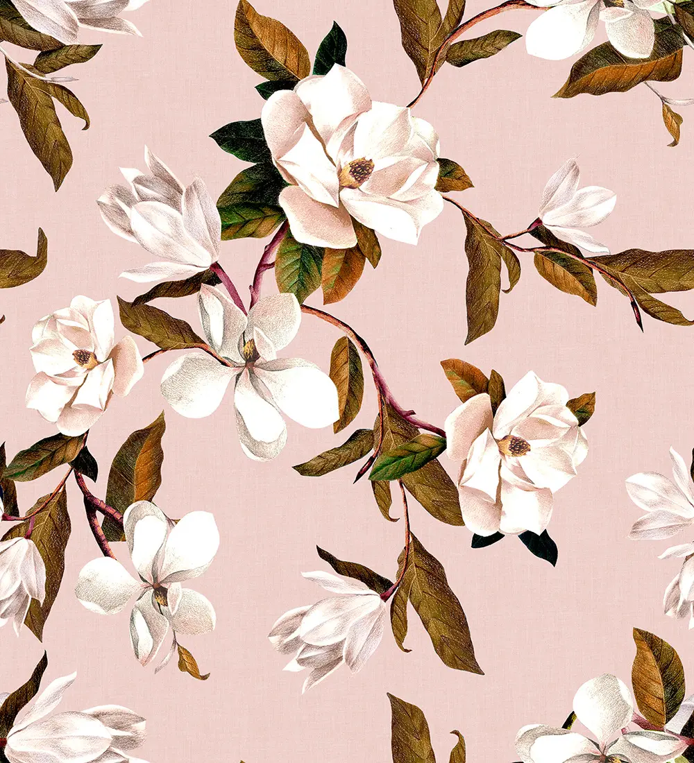
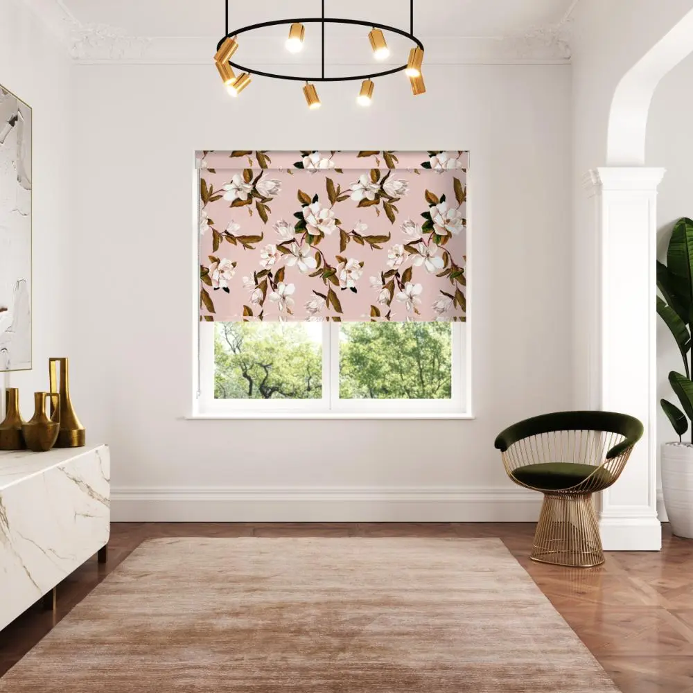
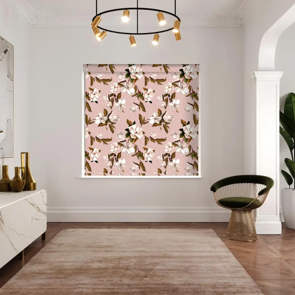
Opal Floral Pink
Add a soft, uplifting feel to your windows with the Opal Floral Pink Roller Blind, where a gentle blush backdrop is paired with delicate botanical detailing.
Light and easy to live with, the design brings warmth and subtle movement without overwhelming the space.
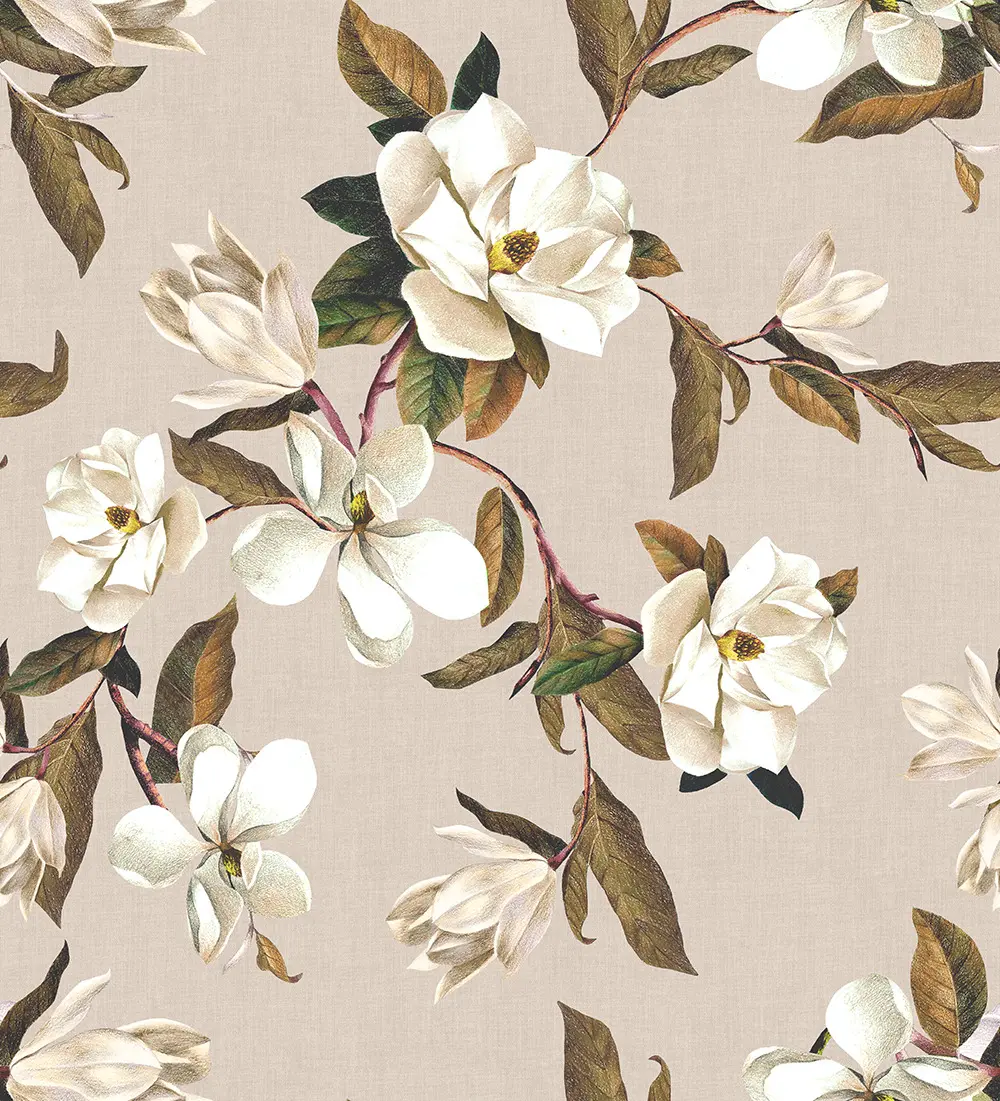
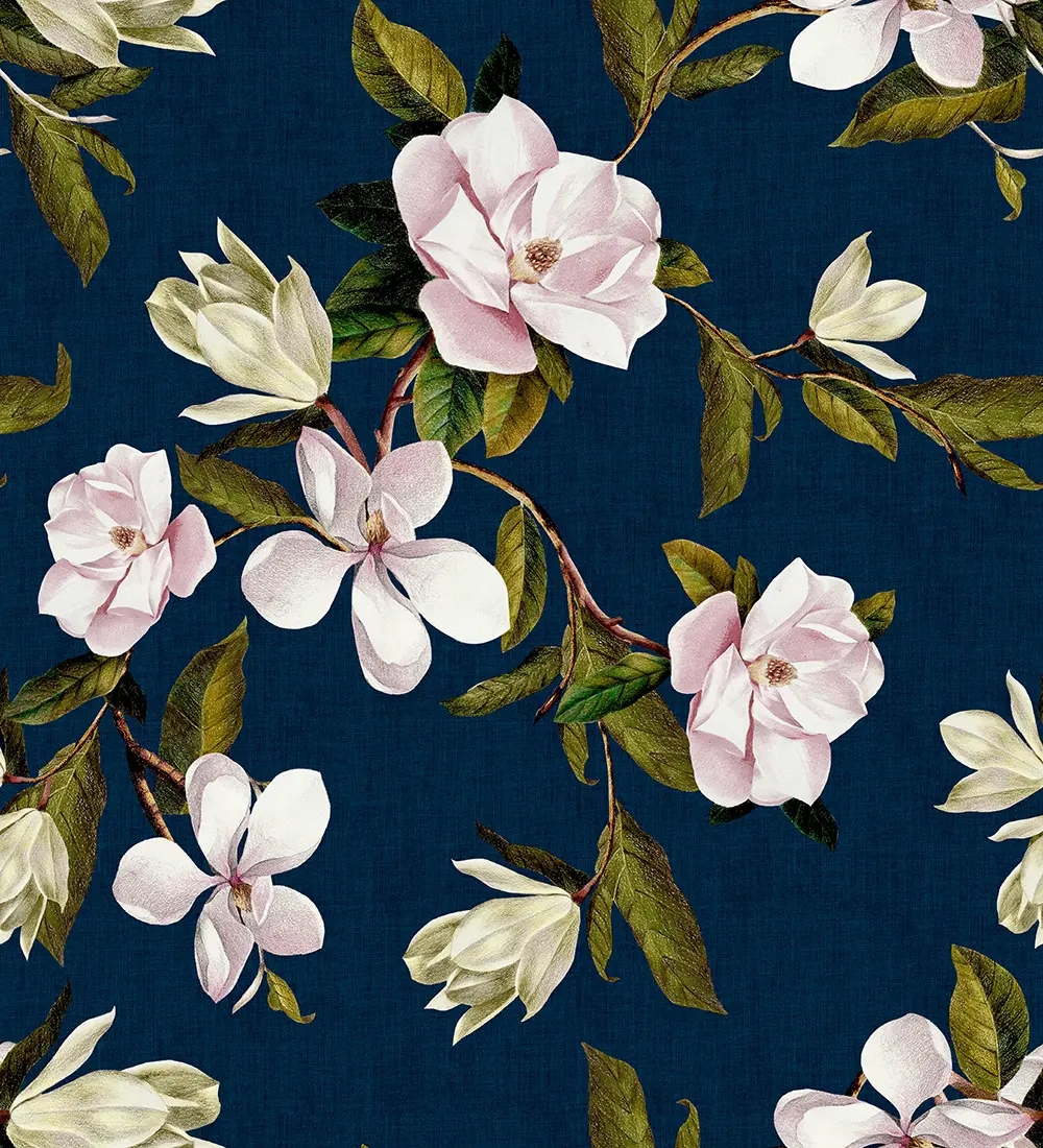
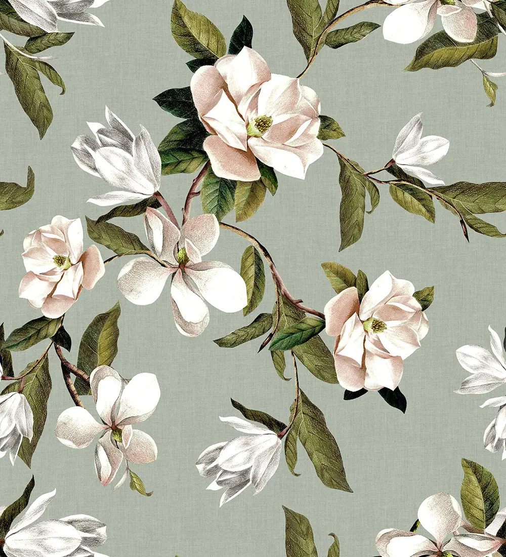
Also in this range:
Product details:
- Material:100% Cotton
A Light, Romantic Touch
Opal Floral Pink brings together a gentle blush backdrop with finely illustrated blooms in soft ivory and muted greens.
The overall effect is airy and uplifting, with a delicate balance between colour and pattern that feels calm yet expressive.
Bringing Softness to Your Space
Perfect for bedrooms, dressing areas, or relaxed living rooms, this design introduces warmth without heaviness.
The pink tone subtly reflects light, helping spaces feel brighter and more open, while the botanical detailing adds depth and movement.
There’s a graceful, modern charm here, with a hint of Ted Baker’s playful sophistication woven into the composition.
FREE NO OBLIGATION QUOTE
Choosing made-to-measure blinds means you get a perfect fit, professional finish and long-lasting performance.
No guesswork. No DIY stress. Just beautifully fitted blinds tailored to your home.
- Accurate measuring by local specialists
- Advice tailored to your rooms and light
- Fabric and style samples to view at home
- No hard sell — ever
- A detailed, no-pressure quote
Styling Pairings
Pair with light oak or whitewashed wood for a fresh, natural look, or introduce brushed brass and soft gold accents for added warmth.
Walls in off-white, pale grey, or muted sage work beautifully, while textured fabrics like linen or boucle enhance the relaxed feel.
Designed for Roller Blinds
As a roller blind, the pattern remains clean and uninterrupted, allowing the flowing florals to take centre stage.
It offers a practical balance of privacy and light control, making it ideal for everyday living while still acting as a decorative feature.
Opal Floral Pink FAQs
Is this pink tone too bold for a neutral room?
Not at all. The blush tone is soft and understated, making it easy to incorporate into neutral schemes without overpowering the space.
How does the colour look in different lighting?
In natural light, it appears fresh and airy, while in softer evening lighting it takes on a warmer, more cocooning feel.
What interiors does this design suit best?
It works well in both modern and classic settings, especially where a softer, more relaxed atmosphere is desired.